Introduction
Each year hundreds of thousands of graphs and charts are made, but why, and what types? Many types of graphs are used to display a variety of data for many industries. Imagine you are a business person with sales results to analyze. Now imagine looking at an easy graph or chart displaying all of your data. If you did not have the graphs and charts you would have to analyze all of that data one by one, NOT FUN!
What graphs would you use to analyze your data though? Consider these popular graphs as options:
What graphs would you use to analyze your data though? Consider these popular graphs as options:
Line Graphs
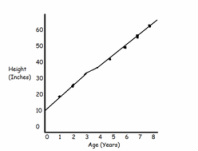
The line graph is the most commonly used graph. It is used in
science, math, and business as well as other industries. To make a line graph you draw an “L” then you
label the y-axis, the x-axis and the title, lastly you plot your points based on the x and y coordinates. Here is an example:
science, math, and business as well as other industries. To make a line graph you draw an “L” then you
label the y-axis, the x-axis and the title, lastly you plot your points based on the x and y coordinates. Here is an example:
Bar Graphs

Bar graphs are most commonly used for comparing data side
by side. They are used in many industries such as business and science. They could be used in business for
comparing sales of different products. To make a bar graph you draw an “L” then you label the y-axis, the x-axis and the title, then you draw bars corresponding to your data. Here is an example:
Pie/Circle Graph
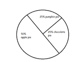
Pie/ Circle Charts are used when comparing parts of data that equal a whole. The different parts are usually conveyed in percentages. To make a Pie/ Circle Chart you draw a circle then split it up into your parts. Here is an example:
Pictographs
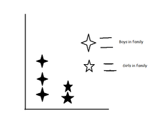
Pictographs are used to compare the frequency of the data points. Pictographs are graphs made of small symbols which are grouped together to show the frequency of the data they represent. The graph should have a key that shows what the symbols represent. They are used for easy counting and they are easy to make. Here is an example:
Conclusion
Graphs can be used to help us organize data so that it is easier to analyze. There are many types of graphs for different purposes and different skill levels. The most commonly used is the line graph. Pictographs are kind of the little kid graph. Bar graphs and pie graphs are used for comparing data side by side. Graphs are very helpful but can also be stressful.
Quotes
"Bar graphs are used when there is a numerical comparison"
I think this is important because it shows the purpose of the graph.
"Bar graphs compare data in a simple format consisting of rectangular bars."
It explains exactly what bar graphs look like.
"A pictograph represents it's information with little pictures"
It is a diffrent type of graph that most don't use.
Paraphrases
All of the following paraphrases helped me get my infomation:
It is easy to make a line graph outline, just draw a Large "L".
Circle/Pie Graphs represent a whole, the "slices" represent sections of the graph.
Line graphs are the most common form of graph used today.
It is easy to make a line graph outline, just draw a Large "L".
Circle/Pie Graphs represent a whole, the "slices" represent sections of the graph.
Line graphs are the most common form of graph used today.
Citations
"Types of Graphs and Charts." Types of Graphs and Charts. N.p., n.d. Web. 13 Mar. 2013.
"Types of Graphs." : Bar Graph, Scatter Plot, Pie Chart. N.p., n.d. Web. 13 Mar. 2013.
Learner, Marcia. Math Smart Juinor. New York: Random House, 1995. N. pag. Print.
"Types of Graphs." : Bar Graph, Scatter Plot, Pie Chart. N.p., n.d. Web. 13 Mar. 2013.
Learner, Marcia. Math Smart Juinor. New York: Random House, 1995. N. pag. Print.
